Overview
Hearth & Honey is an ecommerce designed to feel calm, tactile, and grounded while still guiding users smoothly from discovery to purchase.
Case Study
Ecommerce Website Design
An thoughtful ecommerce for a clean self-care brand, built to balance warm storytelling with clear product browsing and confident checkout flow.
Hearth & Honey is an ecommerce designed to feel calm, tactile, and grounded while still guiding users smoothly from discovery to purchase.
Create a storefront that feels thoughtful and trustworthy, with clear product navigation and a checkout experience that supports conversion.
Many self-care shops either feel visually generic or difficult to shop. This solves both by pairing strong art direction with practical UX choices.
A warm visual system, structured product hierarchy, and focused content flow across homepage, shop, story, help, and cart pages.
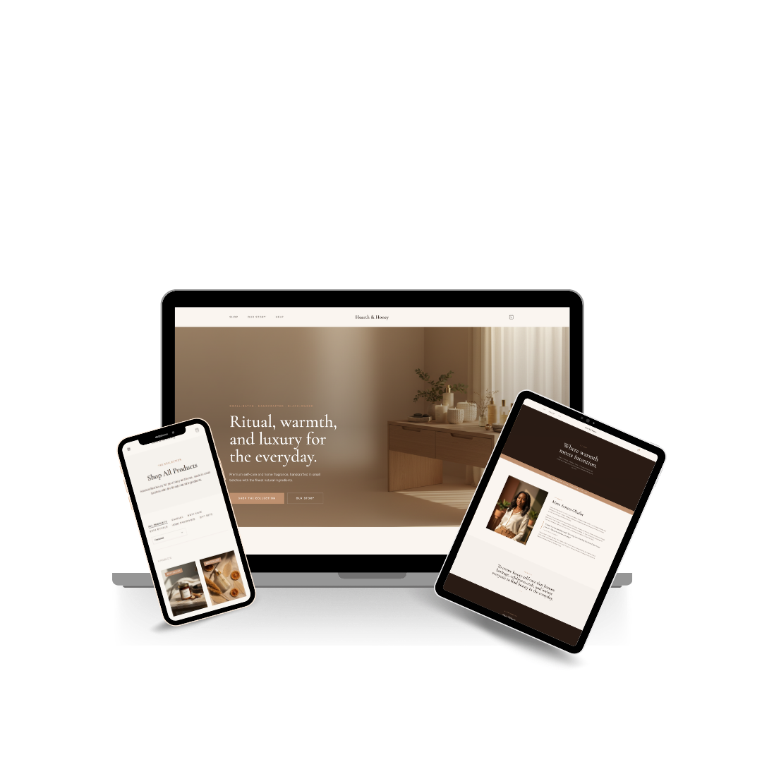
Project Views
Each screen is built to support one key moment in the shopping journey: discovery, storytelling, product browsing, support, and checkout.
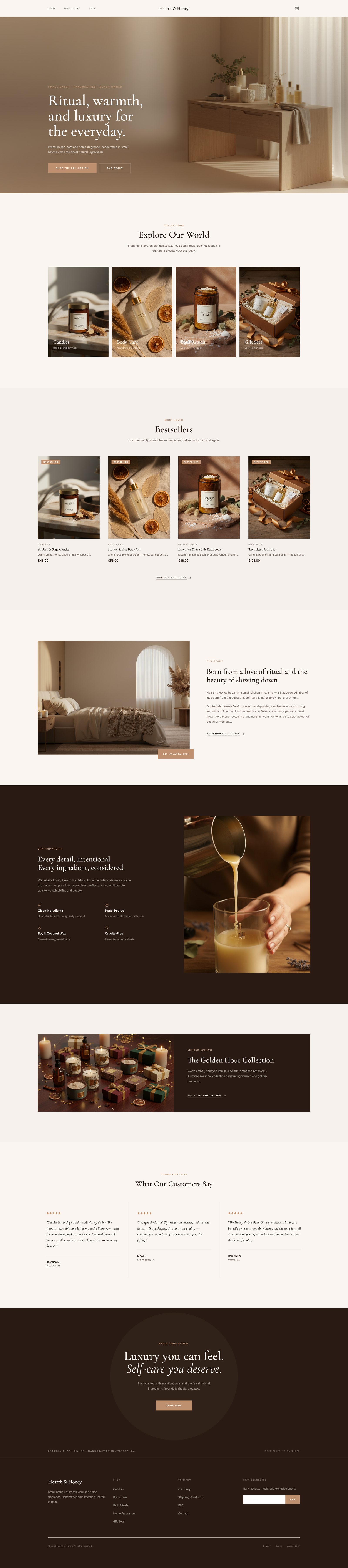
01
Introduces the brand with a clear visual hierarchy, featured collections, and CTA flow that guides users toward shopping.
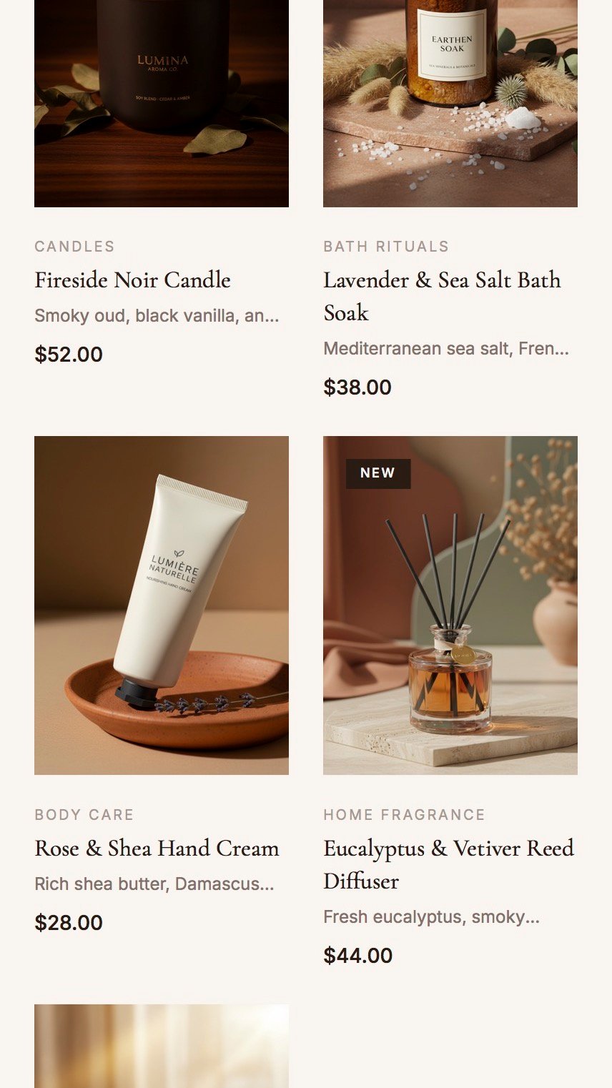
02
A cropped 9:16 mobile preview showing how product browsing, filtering, and card hierarchy stay clean and readable on phone screens.
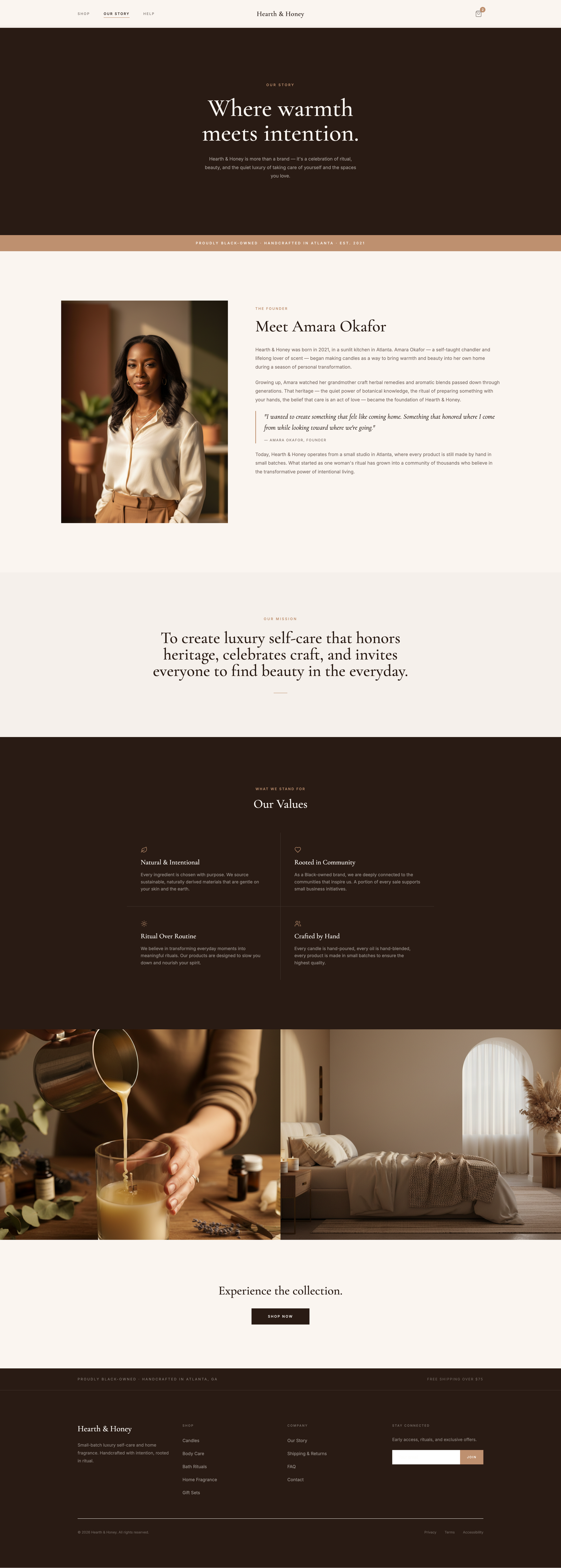
03
Uses thoughtful pacing and warm imagery to build trust and reinforce brand values without interrupting the shopping experience.
04
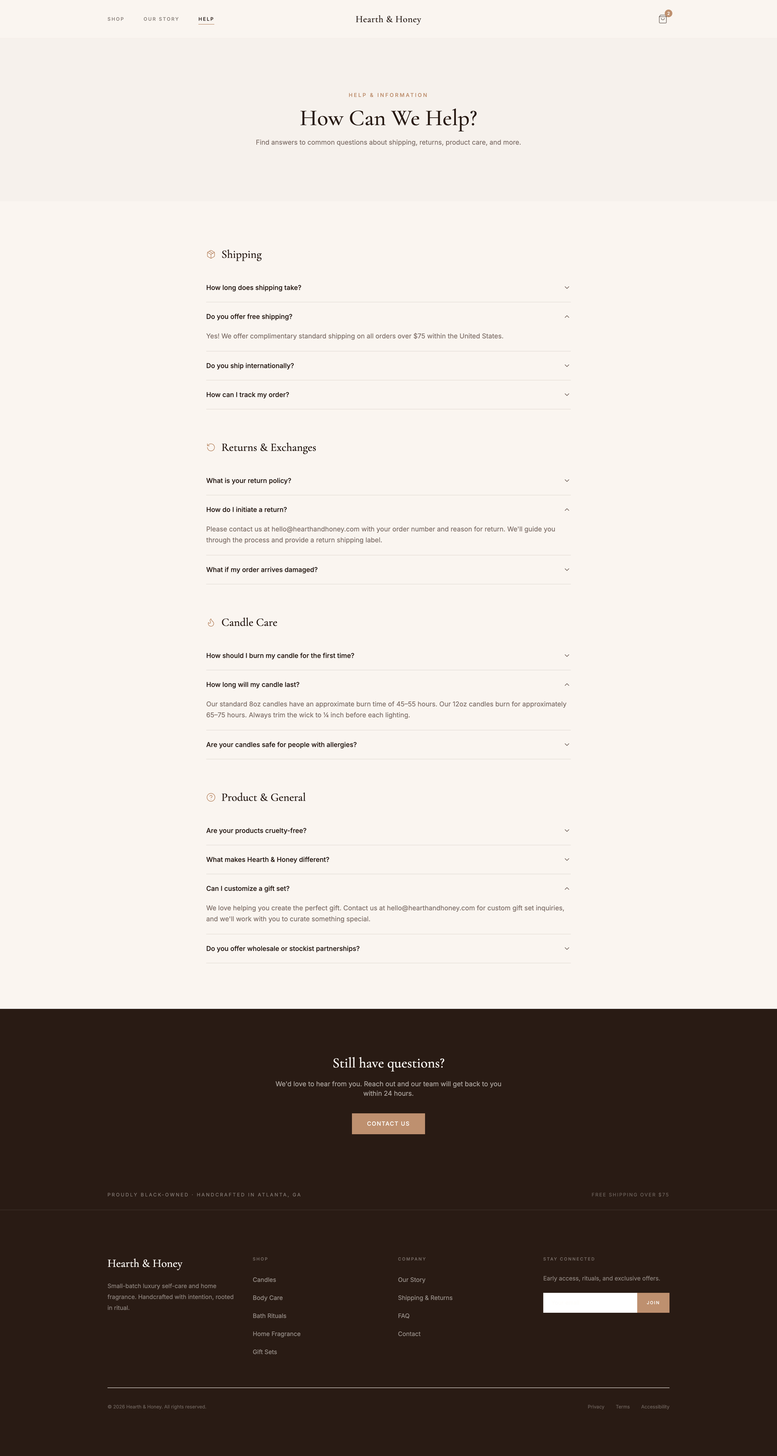
A structured support page that answers common questions quickly and reduces friction before and after purchase.
05
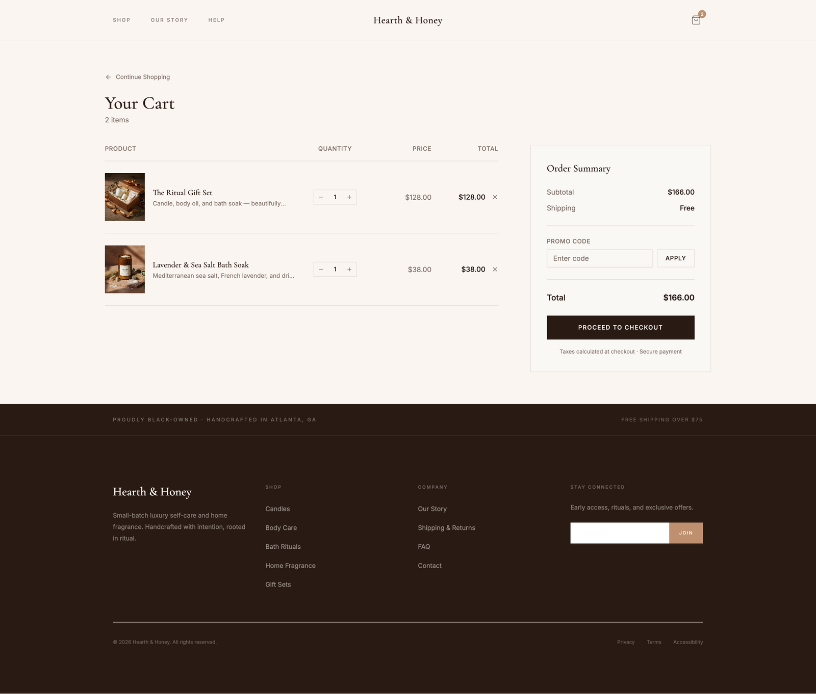
A clear cart layout that keeps quantities, totals, and next actions easy to scan so users can complete checkout with confidence.
Design Notes
Need a store experience like this?